
Overview
Project
Chase App feature concept. Chase Bank is continuously growing with users on their app. They have put a lot of effort in the past on providing most relevant products and now want to focus on enhancing their budgeting tools.
Role
UX Researcher, UX Designer
Timeline
2019 - 2 weeks(70 hrs)
Tools
Pencil & paper, Sketch, InVision
Problem
There are currently many budgeting apps out in the market and most are overwhelming. Currently users are not consistent in using Chase’s current budgeting tools
Challenge
Create a budgeting feature that compliments Chase’s existing tools and is functional for users no matter their financial status.
The Process
Research
1:1 Interviews
Secondary Research
Persona
Define
Sketches
User flow
Ideate & Testing
Mock-ups
Prototype
Usability Testing
Research
Working on an existing feature, I wanted to first do some research on budgeting. Only 2 out of 5 Americans utilize a budget. Generation Z and millennials, are saving nearly 16% of their annual income away for retirement, including employer contributions. Generation X and baby boomers, were putting aside around 14-15% of their earnings.
Knowing that the younger generations were saving, I dug even deeper to see how they manage their money to reach those saving goals. 1⁄3 of millennials have downloaded some type of budgeting app but the reality was that many would stop using it after opening the app a few times. At this point I struggled to understand why users were no longer using these apps so I decided to find the answer to this question through 1:1 interviews.
All of my participants at some point in their financial journey struggled to stay on top of their budget. Even though there were many different options on budget apps, they would eventually stop using it. Chase customers didn’t even know that the app had budgeting tools. The biggest complaint was that these apps took a lot to setup, and it was discouraging. Those that did setup their account still couldn’t tell me off the top of their head what they spent in a month or in a week.
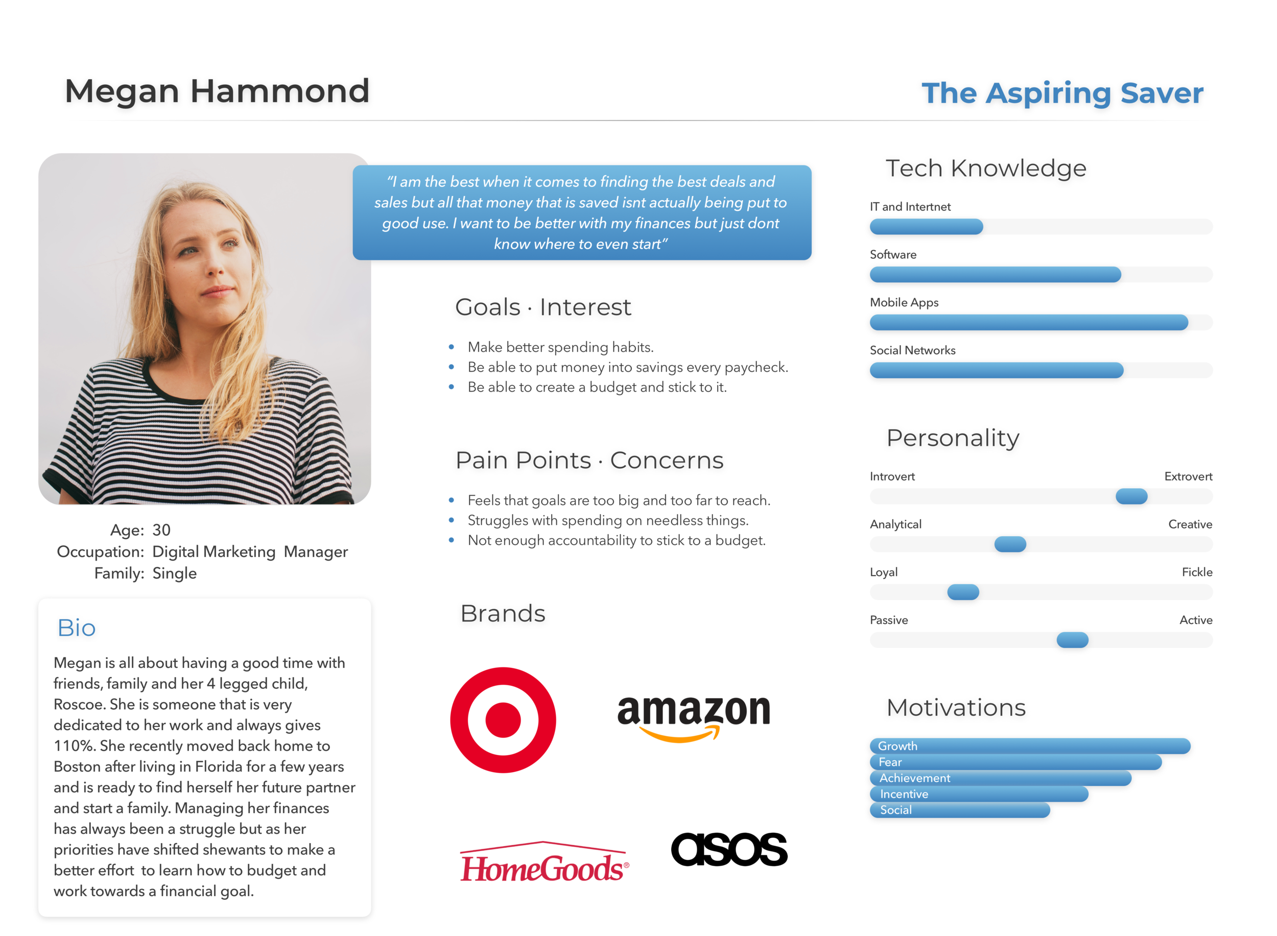
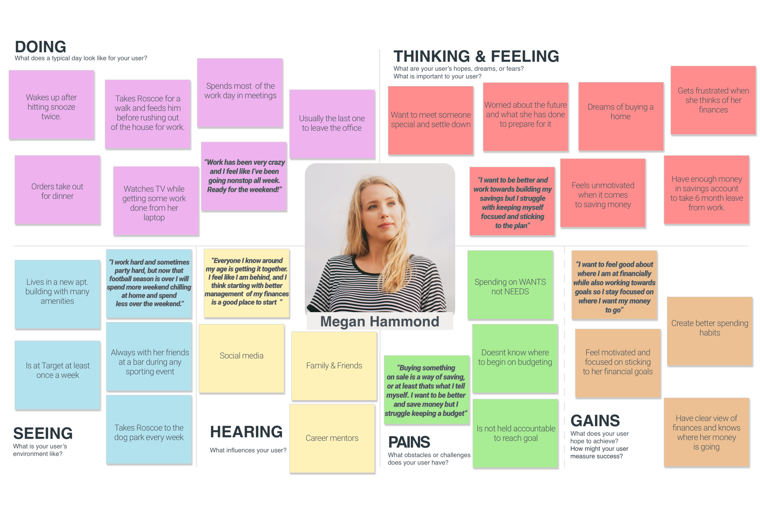
It was obvious that Chase needed to take budgeting back to the basics and it needed to be done in a way that was simple, easy and non-intimidating. All of this research led to my persona, Megan. One who has always told herself to do better with her finances but always felt like it was a daunting task.
Define
Having researched so many budgeting apps I didn’t know how I could make graphs and numbers simpler and less intimidating so I thought focusing on a financial goal would be more beneficial for Megan. I began writing down my ideas of how this process would go before sketching. It was at that point I went into the Chase app to reference something and I found that they already had a “Goal Plan” feature.
I revisited my research I realized that my persona, Megan needs to learn about her finances and how to manage them before she even starts a working towards a goal. She needed a simple to use budget that is readily available to her. This is when came up with idea adding a budgeting feature to the phone’s wallet (iOS & android wallet).
Chase already has a feature in the phone’s wallet showing latest transactions, so I thought of adding a tab with Megan’s budget. Since the wallet app already has its own layout and UI kit I kept my sketches within those guidelines. At times this made things challenging, but in the end it helped me keep things simple and stay focused on what Megan truly needed out of a budget.
Below are the main components I wanted to integrate into the wallet:
Clear and easy to read budget chart.
In each transaction have the category it is assigned to.
Ability to edit transaction’s category
Ability to edit categories.
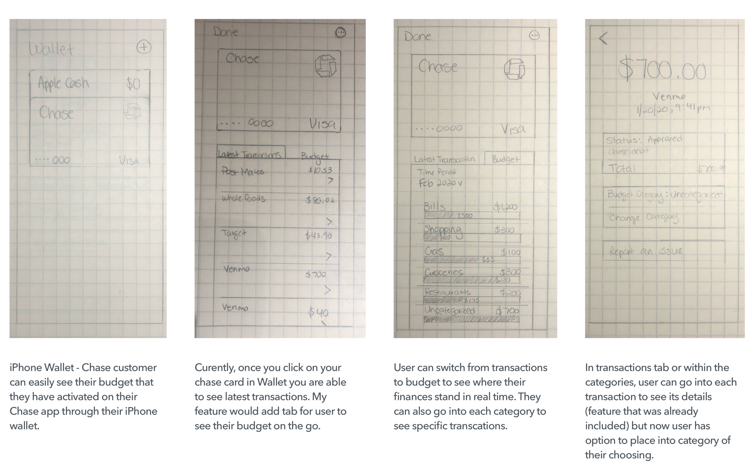
For the purposes of this project and it’s mock-ups I focused on the iOS wallet.
To create a course of action for a financial goal, Megan first needs to start from the beginning, know where her money is going and how much of it is she spending. Only then she can move on to the next step of working towards her financial goals. Adding this simple budget to the wallet app makes it easy for Megan to keep track and update on-the-fly.
For this project I needed to sketch my ideas first before creating a user flow. The user flow on the right is a scenario where Megan checked to make sure a recent transaction was categorized correctly and had to edit a category in her budget. And this was all done without even going into the app.
Ideate & Testing
Being able to update transaction on the go and check-in on spending is exactly what Megan needs to start her financial journey. A feature this quick and easy to add into her routine will motivate her to make better spending decisions. As discussed in my strategy, I did not want to drastically change the layout. Today’s budgeting apps can be very detailed and complex but for Megan it is important to stick to the basics of her budget and start her financial journey from there.
Within a category, Megan is able to review all of the transactions for that month, edit the category itself and even edit a transaction’s category. Being able to make these changes easily keeps Megan engaged and aware of her finances. Overtime this helps her make better spending habits.
A big pain point I saw throughout my research was the long process of moving transactions into correct categories. Now Megan can update her transaction’s category and even create new ones. Making these updates in seconds not only makes the process more enjoyable but also makes it easier for Megan to keep her budget up-to-date.
After adding my mock-ups to a prototype I began usability testing to see how users interacted with the feature and how well they completed the tasks presented to them.
All of my participants use or have used a budget of some form. They were all tasked to:
Explain their understanding of the budget
Change transaction’s category
Edit a category
Create a new category
Even though all were able to complete the tasks, there was some insightful feedback.
Majority of feedback mostly focused on the budgeting page it self. Some of it was around the layout and information provided and others where on expanding this feature. Though I took all of this into consideration on my iterations, it was important for me to make sure each iteration stay true with Megan’s need to learn and be comfortable with the basics of her finances. View prototype here.
Takeaways
I loved working on this project because it made me have to think outside of the box. Starting with one idea that the app already had pushed me to spend more time understanding Megan. She didn’t need a new innovative feature, all she needed was budgeting stripped down to the basics. Those that can’t to stick to extensive and detailed budgeting apps just needed to take the process a bit slower, piece by piece. Knowing where your money is going and learning how to manage it is already a big challenge for users like Megan and once she masters that, the tools within the app become much more useful to her.