
Overview
Role
Product Designer
Timeline
Q4 2020
Tools
Pencil & paper, Sketch / Figma, Miro, Invision
Project
Deliver a new experience in REEF Cloud for viewing and utilizing Tableau reports. This is part of a bigger initiative to migrate all REEF tools and processes into one centralized location.
Problem
Tableau reports are a necessity for B2E and B2B users to find areas of improvement. Due to the amount of tools and programs used, collaborating and sharing reports with other users has become a pain point. Also as the company grows users need a more efficient way to see data that is focused on their part of the business.
Challenge
Tableau does have collaboration and sharing features so it is important to understand why they’re not currently being utilized. Also, to create a feature that allows users to see KPIs that are focused to their part of the business.
The Process
Research
1:1 Interview
Define
User Flow
Sketches
Ideate
Wireframes
Prototype
Testing
Usability testing
Research
During my time at Chewy.com, Tableau was also used for reporting and for my role it was a tool I used everyday. I would work with the analyst team to create dashboards that were specific to the project I was on so I can have a clear view of the metrics that were most important to me. So with my knowledge and experience with Tableau, I went straight into creating a 1:1 interview plan to get insight on what the users current goals and pain points were when it came to finding, analyzing and sharing these reports.
After interviewing 6 team members across REEF, the user’s goals and pain points were established. To no surprise some of findings aligned with with assumptions I already had. Though the overarching business goal was to have all tools used in one place, users clearly needed more personalization around data and a better standard on sharing and collaboration.
Pain Points
Have to go through many steps to find outliers
User doesn’t always trust the data that is being shown
No centralized view of important metrics
User is at times confused on metric vocabulary
Goals
Accessing dashboards with ease
Use Tableau features, improving efficiency
User customized KPI overview
Completing all necessary tasks in one place
Define
Since this is a tool that was being moved into REEF Cloud, I first needed to define the user flow. Aligning with the other designers working in REEF Cloud was important so that I can better understand the the sitemap and decide where Tableau should live. Product initially thought it should go under Financial Reporting but this was a module focused specifically for real estate admin users (B2B); Tableau would touch all types of reporting, not just finance, and it would be used by all users (B2E & B2B). After sharing with product my insight of the other modules and the role that tableau would play, I decided to give Tableau in its own module
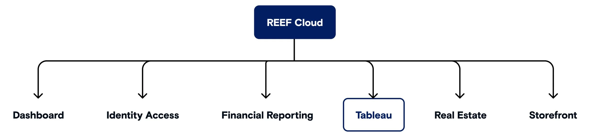
Having gone through each of the other modules in REEF Cloud it sparked some ideas on how to personalize the tableau experience. Identity Access is where users are defined and created and this is where my idea sparked to have Tableau’s module overview page to focus on the signed in user’s top metrics & KPIs based on their role. As I worked through the user flow I kept going back to my interview findings to make sure I was focusing on those goals and pain points.
During the process of creating the user flow, there were discussions with product and engineers that were familiar with Tableau’s API. There were a list of constraints when it came to adding new tools or features. Having a personalized view of metrics and KPIs on the module page was a feature that kept being pushed back by engineers. Knowing that this page would be resolving many of user’s pain points, I stayed away from introducing any other new features that would take up more time to develop and planned to improve the UX and UI of Tableau’s current tools. This ended up being a great way on compromising with the engineers.
I usually start sketching ideas after a user flow has been designed, but with this project I started doodling prior that. My sketches really helped me decide on the direction that was best for the user especially taking into consideration the technical constraints. Its pretty much chicken scratch but it does help get things started for me. In future projects, I combine this with some lo-fi’s and it has helped see the progress, especially when collaborating with other designers.
Ideate
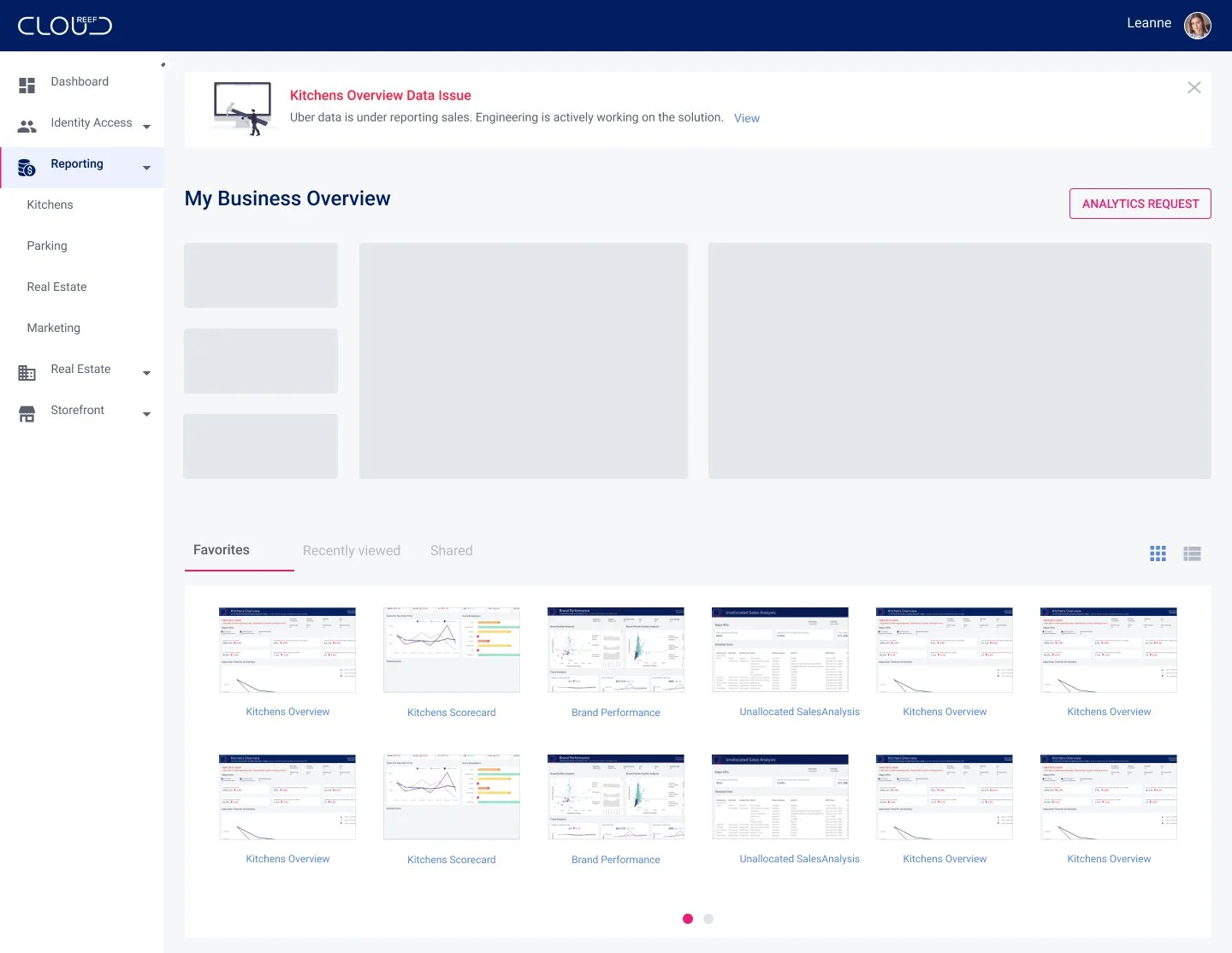
During my research and defining stages on this project, REEF Cloud was going through a revamp of its design system and module names. This gave me the opportunity to work closely with our design system manager creating components that were specific to tableau’s constraints. Below you can see how the module page progressed from the old design system to the new.
Old design system
New design system
Looking at the old or new design system, this screen hit many goals and pain points shown through my interviews. As soon as the user gets to the reporting module they can:
Access a report easily
See KPI’s that are part of the user’s scope
Ability to submit new report requests
Notified when a report is down
User created alerts for reports that hit a certain threshold
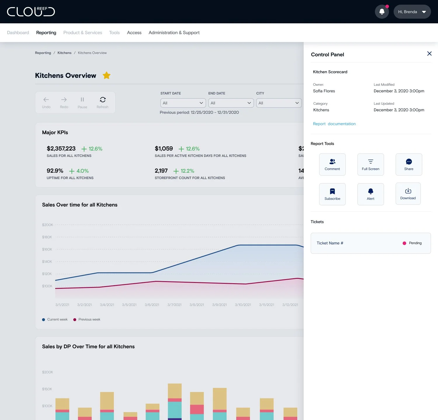
Due to our technical constraints, engineers had to implement colors, font, containers and filter components in each report so that it has a seamless look within REEF Cloud. What really took these report pages to the next level was taking all of Tableau’s features into a side drawer called the Control Panel. This feature brought together all the information of the report, it’s tools and even ticket view for when there is a data issue with the report. Centralizing all the tools and information needed in one screen.

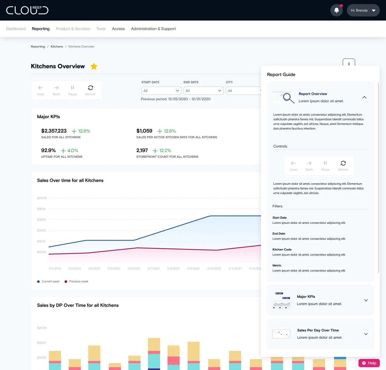
A big pain point that kept coming up in my interviews focused around what certain metrics meant and the language being used. A “Help” cta at the bottom of the screen will give users information specific to each report. This help new and current users navigate the report and understand how metrics are defined.
Tools like sharing and commenting were rarely used in the Tableau website because users couldn’t find on the report page. Now, these tool have been given more hierarchy in the side drawer.
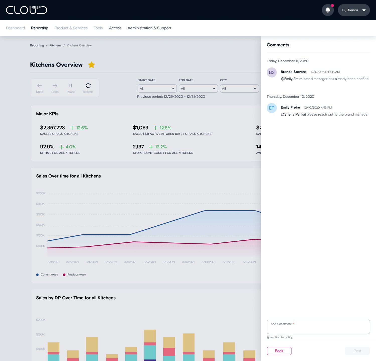
Throughout my ideating process I would share my work during our feedback sessions or design reviews. These session really helped me stay focused on what the what the needs were for the user and be able to explain the reasonings behind my designs.
Testing
Though both product and design felt confident on the new experience we always put all of our designs through some level of testing. Usability testing felt like the best approach since this would be a big shift in the user’s experience, but I also wanted to make sure that my design solutions really tackled the user’s pain points and helped them reach their goals in reporting.
Secondary Learning Objectives
Primary Learning Objectives
Understand how the user is actioning findings from the report
Gather feedback on which tools are useful to user
Gather feedback on user’s ability to access a report
Determine if the report guide is helpful to the user
Gather feedback on the Control Panel feature
A total of 8 employees across different roles and departments tested with me via video call. For each testing session I would walk the participant through an intro, give a scenario and asked them to complete 6 tasks on the prototype provided. Our research manager worked closely with me to make sure each of the tasks were connected to an assumption and that my questions didn’t lead the user in any which way. Once testing was complete I gathered all of my findings and created a test findings deck to share with both product and design.
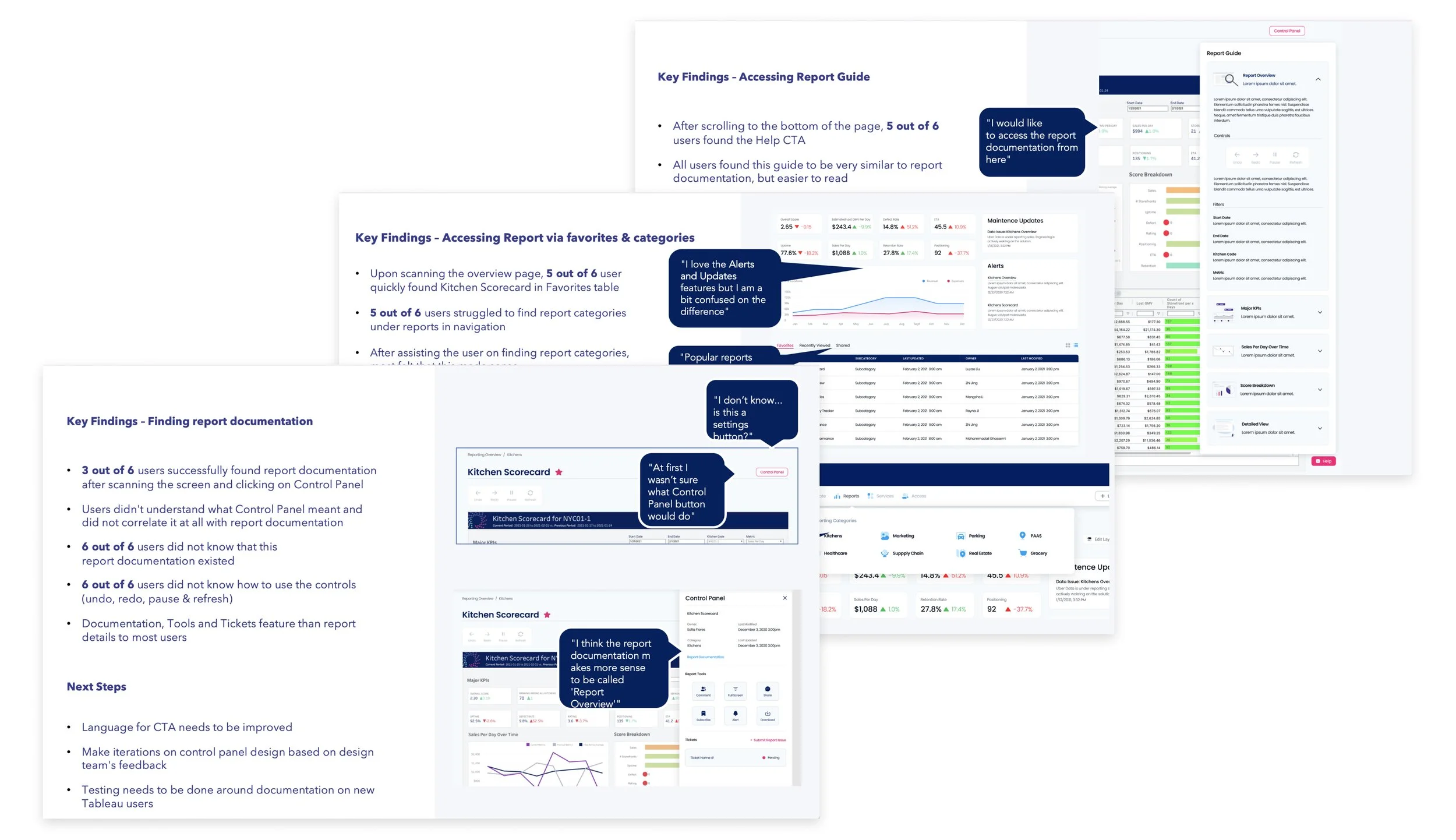
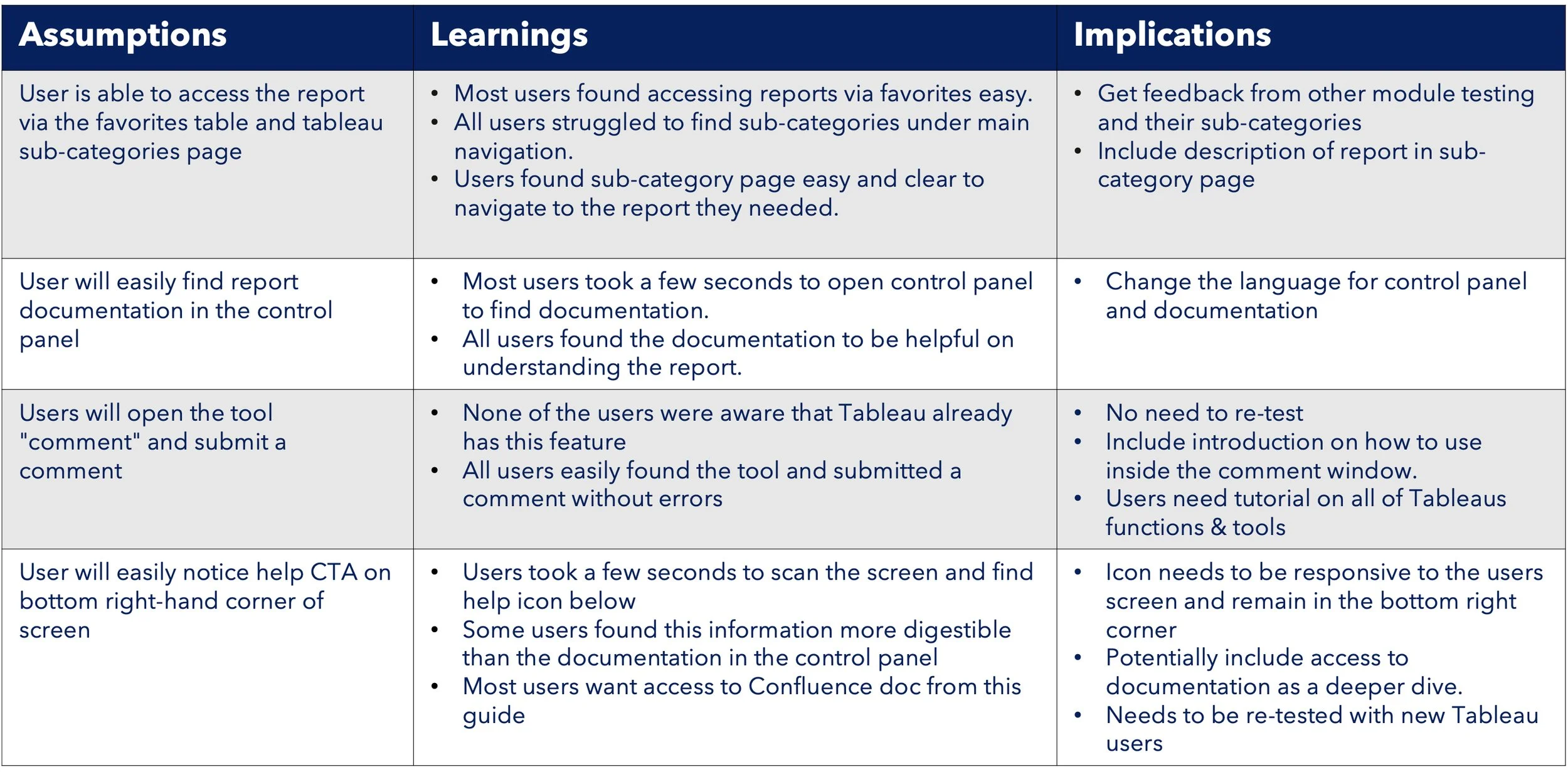
Overall the feedback was great but it was clear that there were still some tweaks that needed to be done around copy and the actual content that is provided around report guides and documentation.
Testing also raised the question to the data team on how REEF is onboarding new tableau users and what the process should look like, so that everyone has a good starting point with their reporting.
Once these updates are completed another round of testing would be done to confirm that the content is giving value to the user
Next steps
After testing, this project had to be deprioritized due to needing designer on other B2B projects. In Q2 of 2021 we were able to take a step forward with a simplified version, just bringing in the reports as they were in Tableau’s site until we had more resources to complete the entire experience.